Visualizing Citibike Data
I compiled citibike ride data from 2013 to 2016 and used this to create a story in Tableau.
Below are some of the more interesting visuals from the tableau story.
Check out my GitHub Repo for all of the visuals created and the code i used to clean and compile the data.
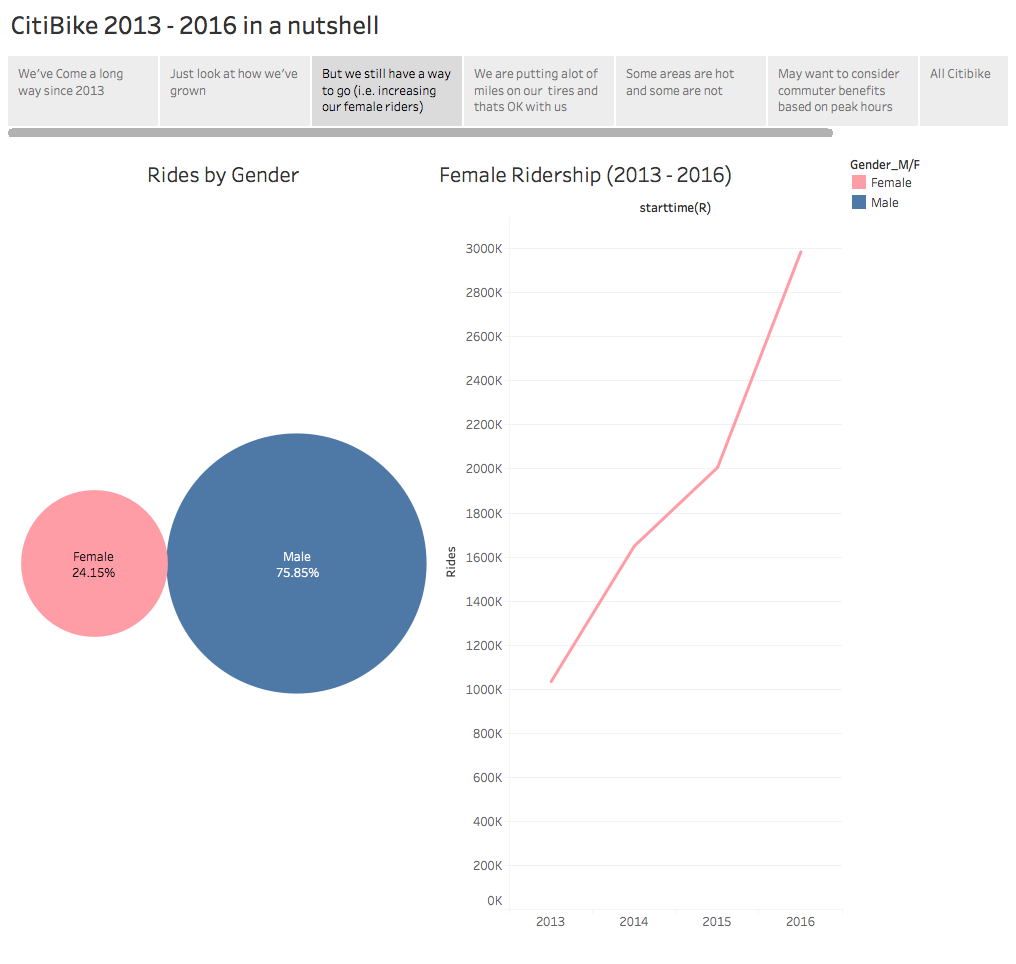
This visual shows all rides separated by gender and indicates there are 3 times as many rides by males when compared to females. Additionally, the growth in female ridership from 2013 to 2016 is depicted with a particularly large spike from 2015 to 2016.
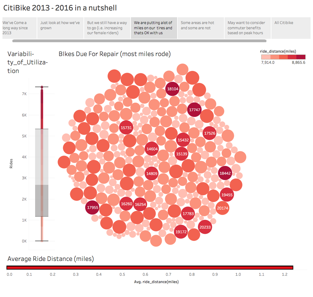
This visual focuses on bike usage. The bubble plot shows heavily used bikes together with size and color proportional to the number of miles rode. There is also a box plot showing the variability of usage amongst all bikes and a horizonal bar chart showing the average ride distance to be just over 1.2 miles.
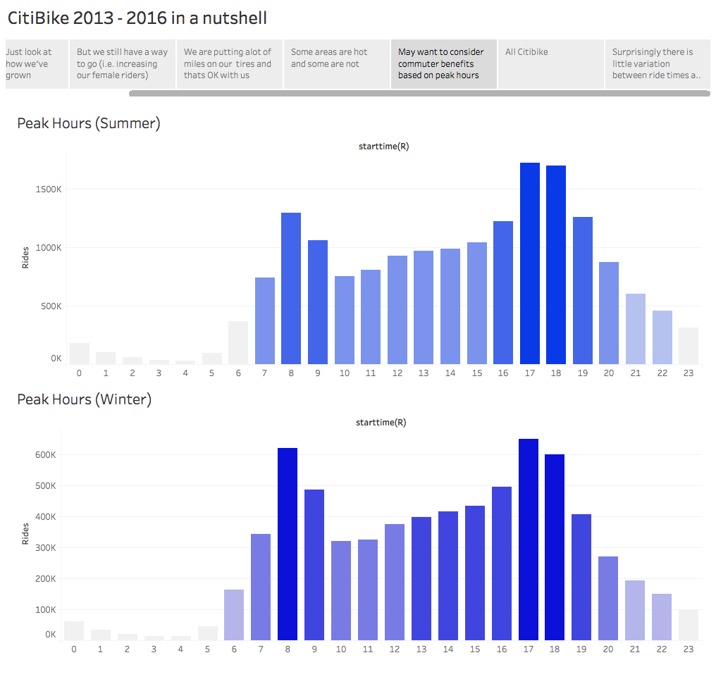
This visual shows the aggregated peak use hours for summer and winter months. Ridership is noticeably higher in the summer. However, both charts show a similar trend of increased ridership during normal commute hours for a standard 9-5 work day.
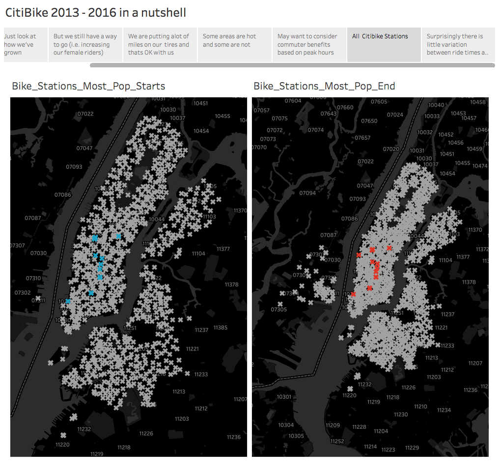
This visual shows all of the stations together with emphasis on the most frequent start and end stations.